Your cart is currently empty!
NASA’s New Visualization Shows How Much Earth’s Oceans Have Risen Since 1993, and the Numbers Are Hard to Ignore

Imagine watching the sea rise in real time. Not through a news headline or a graph on a science website, but through a window, with water climbing steadily past a ruler, year by year, decade by decade, until what began as a gentle swell becomes something far harder to dismiss.
Contents
show
NASA built exactly that. And once you watch it, the numbers attached to sea level rise stop feeling like somebody else’s problem.
Released in June 2023 by NASA’s Scientific Visualization Studio, the animation has been drawing attention from climate scientists, journalists, and everyday viewers who stumbled across it and found themselves watching it more than once. What it shows is not a prediction or a worst-case scenario. It is a record. A precise, satellite-verified account of what has already happened to Earth’s oceans over the past three decades, rendered in a format that bypasses the usual mental distance people keep from climate data.
Before getting to the numbers, it helps to understand what makes this visualization different from anything that came before it.
A Window Into Three Decades of Ocean Rise
NASA’s Scientific Visualization Studio made a specific creative choice when building this animation. Rather than presenting sea level data as a rising line on a chart, they framed the entire thing as a view through a boat’s porthole. Waves fill the circular window. A ruler sits at the edge of the frame. Years appear on screen as time passes. And slowly, with a steadiness that feels almost casual until you register what you are actually watching, the waterline climbs.
That single detail shifts everything. On the right screen, this is not a dramatization or an approximation. It is a to-scale representation of how much the ocean has physically risen. A living room television becomes a literal porthole onto three decades of planetary change. Viewers are not being shown a simulation of what might happen. They are being shown a measurement of what they already have.
Reliable satellite records of global sea level began in 1993, which is where the animation starts. Every year of data from that point through to 2022 feeds into what appears on screen. A blue marker on the ruler tracks exact measurements from the Integrated Multi-Mission Ocean Altimeter Data for Climate Research, while the animated water moves on a smoother 60-day floating average of the same dataset. Nothing is exaggerated. Nothing is invented. Every millimeter on screen reflects a millimeter of actual ocean rise recorded by instruments orbiting the planet.
The Number That Stops You in Your Tracks

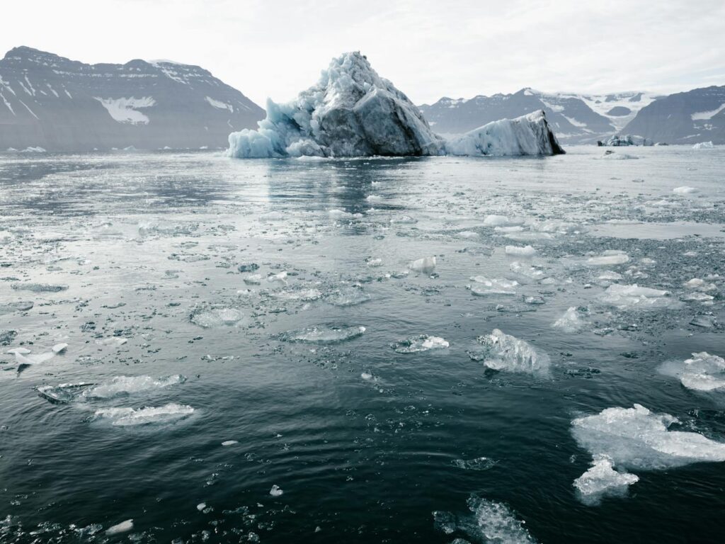
Between 1993 and February 2023, the global average sea level rose 9.85 centimeters, or 3.8 inches. Written out like that, it does not sound alarming. Less than four inches over thirty years. Many people’s first instinct is to shrug.
NASA does not shrug. According to their analysis, that rate of rise is “unprecedented over the past 2,500-plus years.” Not the fastest rise in recent memory. Not the highest on record for the satellite era. Unprecedented across two and a half millennia of planetary history.
Spread across every ocean on Earth, 3.8 inches represents a staggering volume of water. Coastal geography means that even modest rises in the average global figure translate into far more dramatic changes at specific shorelines, in specific harbors, at specific tide gauges where communities have been living for generations. And critically, the rate is not holding steady. It is accelerating. Each decade adds more to the total than the decade before it, a compounding effect that makes the next thirty years far more consequential than the last.
Three Reasons the Oceans Are Climbing
NASA’s sea level rise expert Ben Hamlington has addressed the driving forces behind these numbers, and his explanation covers three distinct but interrelated causes.
Thermal expansion comes first. As greenhouse gases trap more heat in the atmosphere, the ocean absorbs a substantial portion of that energy. Water, when it warms, physically expands. Every degree of warming adds volume to the ocean without a single additional drop of water entering it. As Hamlington explains, “as more heat gets trapped by the atmosphere, a lot of that heat gets absorbed by the ocean. When water warms, it actually expands and that causes sea level to go up.”
Melting ice sheets account for the second major driver. Greenland and Antarctica hold vast quantities of frozen water. As global temperatures rise, those ice sheets warm and shed mass. Meltwater flows off land and into the ocean, adding real volume to a body of water that was already expanding from the heat. Both ice sheets have been losing mass at rates that have alarmed glaciologists for years, and both are accelerating.
Mountain glaciers complete the picture. Around the world, glaciers that have existed for thousands of years are retreating. Many will be gone within decades. As they melt, their water feeds rivers, lakes, and ultimately the ocean. Individually, each glacier contributes a fraction. Collectively, across every mountain range on every continent, their combined loss adds meaningfully to the global total. All three forces operate at the same time. None of them is reversing.
Why Your Coastline May Not Match the Global Average
A global average figure tells an important story, but it does not tell the whole one. Sea level rise does not distribute evenly across the planet’s oceans, and understanding why matters for anyone trying to assess local risk.
“The ocean doesn’t fill like a bathtub,” Hamlington notes. Different parts of the ocean feel different effects depending on two main factors. Ocean dynamics play a significant role. As the climate shifts, ocean circulation patterns change. Currents that have moved water around the planet in predictable ways for centuries begin to behave differently. Water redistributes. Some regions see sea level rise faster than the global average. Others see it slower. Neither outcome reflects the planet as a whole, but both affect real communities in real places.
Ice sheet fingerprints create a second layer of regional variation that few people outside climate science know about. When a massive body of ice loses significant mass, its gravitational pull on surrounding ocean water weakens. Water that was once drawn toward that ice by gravity begins to redistribute across the ocean. At the same time, the loss of ice weight changes how the Earth itself rotates. Together, these effects create distinct regional patterns, what scientists call fingerprints, that determine where melting ice from Greenland ends up versus where melting ice from Antarctica lands. A given coastline’s exposure to sea level rise depends in part on which ice sheet is losing mass and how much.
For residents of Miami, Jakarta, Mumbai, or Shanghai, these fingerprints are not academic. They shape flood projections, insurance risk models, and infrastructure planning decisions being made right now.
What Rising Seas Actually Do to Land
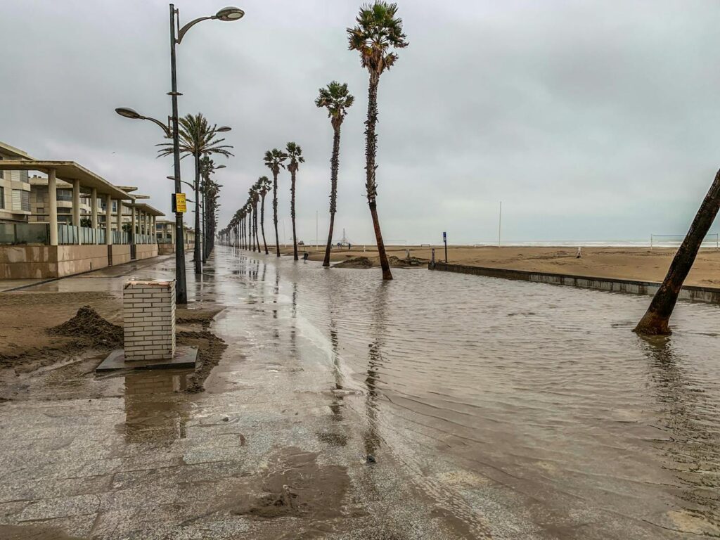
Sea level rise tends to get discussed in terms of beaches disappearing, and that picture is accurate as far as it goes. Shoreline erosion is real, measurable, and already affecting communities that built their identities and economies around stable coastlines.
But the more immediate and widespread effect works differently. Higher baseline ocean levels change the math on every storm that makes landfall. A storm surge that once peaked at a level above any nearby neighborhood now starts from a higher base. Water pushes farther inland. Floods reach streets, homes, and businesses that once sat at a safe elevation. Infrastructure designed around historic flood maps now sits in a new risk category without a single renovation having been made.
Coastal cities bear the most visible burden. Roads, water treatment plants, transit systems, hospitals, and power infrastructure built near sea level face growing exposure to saltwater intrusion and flooding events that occur with increasing frequency. Some of that infrastructure will need to move. Some of it cannot. Communities in low-lying island nations and river deltas face an even starker version of this calculation, where the question is no longer whether to adapt but whether adaptation is possible at all.
Inland regions are not entirely insulated. As storm surges push deeper into river systems, flooding extends further from the coast than historical models predicted. Natural environments, including estuaries, mangroves, and coastal wetlands that serve as buffers between ocean and land, face disruption that weakens the very systems that once helped absorb storm energy.
Why Seeing It Changes Everything
Sea level rise has been reported, studied, and debated for decades. Charts showing upward trends have appeared in thousands of scientific papers and news articles. Most people have encountered the data in some form. Fewer have felt it.
NASA’s visualization works because it removes the abstraction. A porthole is something anyone who has been on a boat recognizes immediately. Water filling a window is something the human brain processes as a physical reality rather than a statistical concept. When the waterline on that ruler has risen nearly four inches over the course of a short animation, the mind does not reach for context or caveats. It simply registers that the water is higher than it was.
That response matters. Climate science has long grappled with a communication gap between what researchers measure and what the general public absorbs. Figures that represent genuine planetary emergencies can pass through a person’s awareness without leaving a mark, particularly when the timescales involved stretch beyond a single human lifetime. A visualization that anchors thirty years of data to something as familiar as a ship’s window does not solve that problem entirely, but it narrows the distance between information and understanding.
Satellite records of ocean height have only existed since 1993. In just three decades, they have captured a clear and accelerating trend. What happens over the next three decades will depend partly on decisions being made now, in energy policy, land use planning, coastal infrastructure investment, and international climate commitments. NASA built this visualization to show what is already underway. What comes next remains, for now, a question with more than one possible answer.