Your cart is currently empty!
The Smile You Never Saw: The Hidden Story Behind Coca-Cola’s Iconic Logo

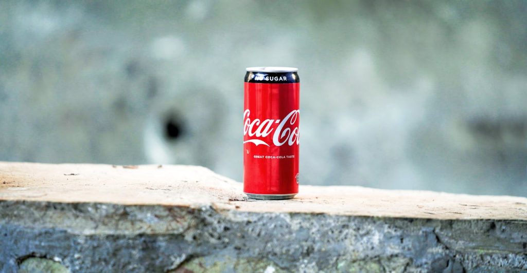
Few symbols are more instantly recognizable than the Coca‑Cola script which is its red-and-white swirl seen around the world. But according to a consumer branding expert, there’s a subtle detail hiding in plain sight: the second “C” in the logo is said to form a faint, curved smile, a design cue meant to embed joy into the brand’s identity.
Contents
show
Below, we dig deeper into that claim, examine counterarguments, and explore how other major brands use hidden logo messages to communicate values beneath the surface.
The “Smile” in the Logo: What the Expert Says
Richard Lau, president of LOGO.com, highlights that the design’s power lies not only in its visual recognition but in the psychological cues it embeds. In his words: “Businesses cannot overlook the value a great logo holds; they are the connection between a company and potential customers, and what customers will remember most.” By drawing attention to the elongated curve of the second “C,” Lau explained that it is believed to resemble a subtle smile, something that “subconsciously reflects Coca-Cola’s emphasis on happiness and joy.” He added: “This subtle message may go unnoticed, but it subconsciously creates a positive association with the brand in the minds of consumers.”

This interpretation connects directly to Coca-Cola’s century-long marketing theme of joy and refreshment. While slogans like “Open Happiness” or the famous holiday ads openly communicate cheer, the supposed smile in the logo works more quietly in the background, acting as a subconscious design cue rather than overt branding. Commentary in Reader’s Digest supports this line of thought, noting that “many people believe the ribbon-like extension on the first ‘C’ acts as a smiling flourish,” reinforcing the company’s image as a bringer of cheer. Crucially, though, these interpretations are speculative; neither Lau nor Coca-Cola’s official logo history confirm the smile as intentional. What they do show is how experts and commentators consistently link the brand’s iconic design to themes of positivity, longevity, and emotional resonance.
A Skeptical Take: “Is the Smile Real or Imagined?”
Skepticism about the hidden smile centers on the absence of evidence in Coca-Cola’s own archival materials. Creative Bloq stresses that “since Coca-Cola’s own history of its logo through the years contains no mention of a smile … it’s looking unlikely to be a conscious design choice.” The official brand documentation charts shifts in typography and stylistic refinements over more than a century, yet never acknowledges the existence of a hidden facial expression. This silence suggests that what some perceive as a smile may instead be a coincidence of script design rather than intentional symbolism.

The same article recalls Coca-Cola’s 2013 “Open Happiness” campaign, when designers deliberately exaggerated the curve of the “C” to mimic a grin. As Creative Bloq notes, “that version had to be edited manually, suggesting it wasn’t inherent to the original design.” This detail underlines the distinction between clever campaign-driven alterations and the historic logo itself. To critics, the fact that an artificial adjustment was required is strong evidence against the smile being part of the original intent.
From this perspective, the “smile theory” functions less as a confirmed design element and more as a retrospective interpretation layered onto the brand by observers. The enduring debate underscores how audiences often project meaning onto visual cues, but without explicit confirmation, the smile remains more imagined than real.
The Evolution of Coca‑Cola’s Branding Beyond the Logo
The resilience of Coca‑Cola’s visual identity is best understood by looking at how the company has consistently paired its script mark with broader cultural storytelling. The Coca‑Cola Company highlights that “the famous Coca‑Cola contour bottle was introduced in 1915, and the first advertising featuring Santa Claus carrying a Coke appeared in 1931.” Both decisions reveal how the brand anchored its logo in physical design and seasonal culture, creating associations that extended far beyond a wordmark.
The contour bottle’s design was so distinctive that, according to Coca‑Cola’s own history, it allowed consumers to recognize the drink “even in the dark or when broken.” This move tied the product’s identity not just to taste but to form, reinforcing recognition in ways few competitors could match. Similarly, the use of Santa Clausdepicted in a red suit and jovial spirit, embedded Coca‑Cola into holiday culture. Advertising historian Mark Pendergrast noted that these campaigns “helped define the modern image of Santa Claus” while positioning Coke as a symbol of joy and togetherness.
By consistently weaving its branding into cultural milestones, Coca‑Cola built what scholars describe as “one of the most enduring identities in modern marketing.” The lesson is that the logo alone did not carry the full burden of storytelling; rather, it was the interplay between visual design, packaging innovations, and cultural campaigns that ensured the brand’s identity remained vibrant across generations.
Hidden Messages in Logos: The Bigger Picture
Logos often carry more than meets the eye. Beyond serving as identifiers, many of the world’s most memorable marks conceal intentional design tricks that quietly reinforce what the brand stands for. These details are not decorative accidents; they are deliberate strategies meant to spark recognition, tell a story, or reward attentive viewers. Here are some of the most cited examples: Hidden messages in logos usually come from concrete design decisions rather than mystique:
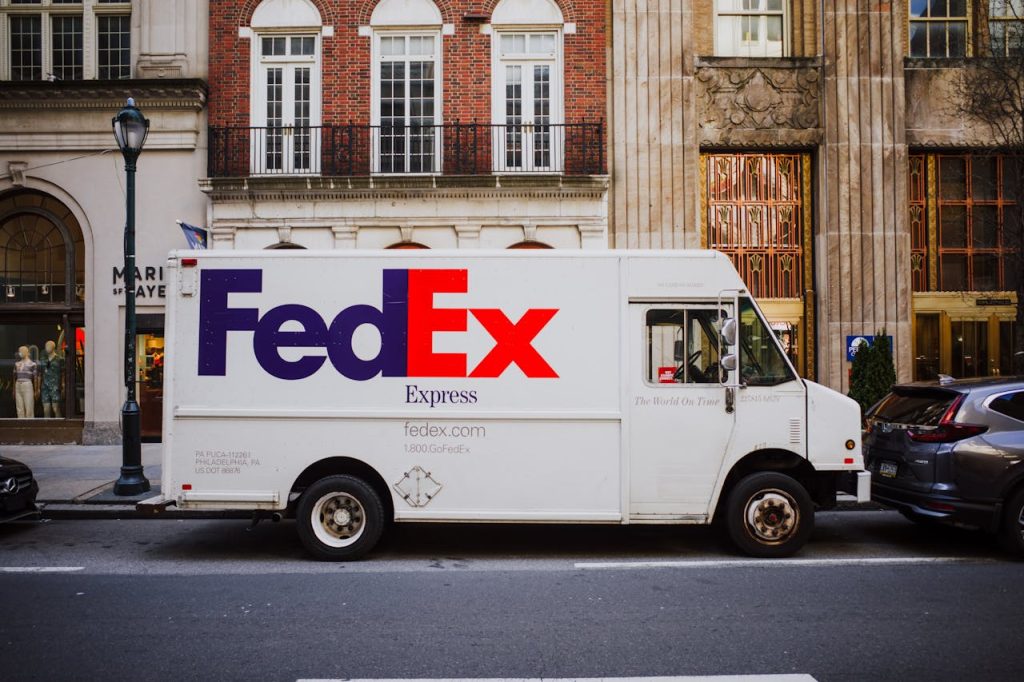
- FedEx – Designer Lindon Leader has explained that once he noticed the potential of the negative space between the “E” and the “x,” he pursued a subtle directional motif: “If I could develop this concept of an arrow, it could be promoted as a symbol for speed and precision, both FedEx communicative attributes.” He’s equally clear about why the element isn’t obvious: “The power of the hidden arrow is simply that it is a ‘hidden bonus.’ Either you see it or you don’t.”
- Amazon – The meaning comes straight from the agency that built the mark. Turner Duckworth writes, “We created an icon that encapsulated everything from A‑Z,” and, as part of the brief, “we took their existing frown and turned it upside down.” The firm adds that the curved device communicates breadth in a literal way: “The smile of the arrow could show, quite literally, that they sold everything from A to Z.”
- Toblerone – The brand itself (via parent company Mondelez) has publicly acknowledged the animal hidden in its mountain. As a company spokesperson told Newsweek: “Within the Matterhorn is a bear, which is the symbol of the city of Bern, and where Toblerone is produced.” The bear ties the triangular bar back to its origins without adding any extra graphic noise.
- Baskin‑Robbins – The company’s monogram embeds numeral symbolism to anchor a brand promise. Its own copy nods to the idea behind it which speaks “let’s offer 31 flavors instead,” a line that later became a core identity asset. In a recent brand update, trade press reaffirmed the execution: “The number 31 remains a key part of the chain’s packaging, with the number hidden amongst the ‘BR’ logo.”
Why Hidden Messages Matter (or Don’t)
Hidden elements in logos are not just artistic flourishes—they influence perception and consumer behavior in measurable ways. Unlike overt branding campaigns, these details often work quietly in the background, shaping impressions that viewers may not consciously register. Experts in design and marketing point to several reasons why such subtleties matter, while also cautioning against overreach:

- Emotional reinforcement – Subconscious cues can deepen feelings a brand wants to project, such as trust, joy, or dynamism, strengthening long‑term associations beyond surface recognition.
- Memorability factor – When consumers eventually discover a hidden detail, the logo becomes more memorable, making it easier to recall the brand in a crowded marketplace.
- Conversation catalyst – Hidden features often spark discussions online and offline, providing free publicity as people share “did you know?” moments with others.
- Design credibility – Clever integration of symbolism signals intentionality and professionalism, which can enhance perceptions of brand sophistication.
- Potential downsides – Over‑interpretation or poorly executed symbolism can lead to confusion, skepticism, or accusations of gimmickry if the hidden message feels forced.
Does Coke’s Logo Really Smile at You?
Whether the smile in Coca-Cola’s logo was intentional or imagined, the conversation it has sparked underscores the extraordinary power of branding. A single curve in a letter has been enough to generate fascination, debate, and cultural reflection—showing how deeply people connect with visual identity. This isn’t just about a logo; it’s about the stories, memories, and emotions that consumers project onto symbols that have stood the test of time.

The endurance of Coca-Cola’s mark demonstrates that logos do more than identify a product—they become cultural artifacts. Even if the smile is nothing more than perception, the fact that millions are compelled to look closer speaks to the way iconic design keeps brands alive in the public imagination. In the end, the smile matters less as a confirmed detail and more as a reminder that great branding invites interpretation, sparks curiosity, and stays with us long after the first glance.